Role: UI & Visual Designer
Timeline: June 2020
Tools: Sketch, InVision
Overview
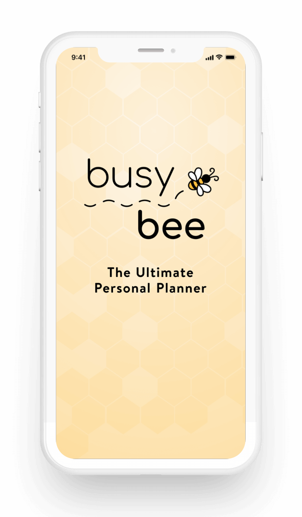
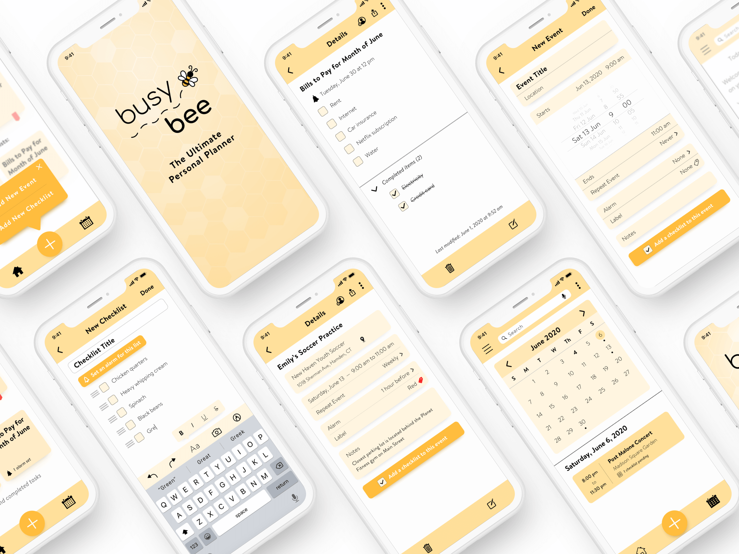
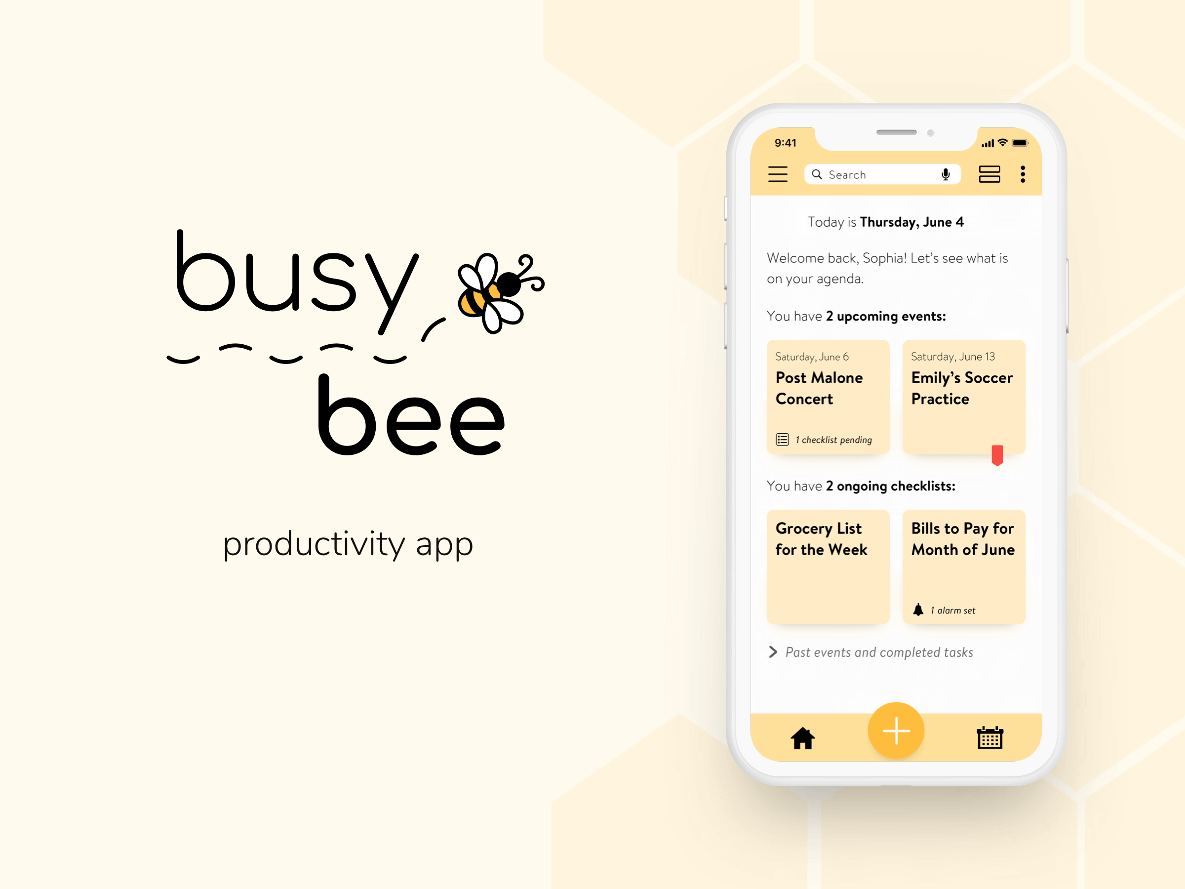
Life is busy, and sometimes we need a little help to keep it organized and manageable. Here comes Busy Bee, a comprehensive productivity app that allows users to accomplish their goals in a simple, convenient, and fun way.
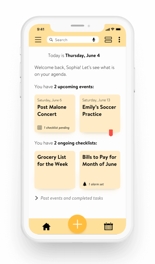
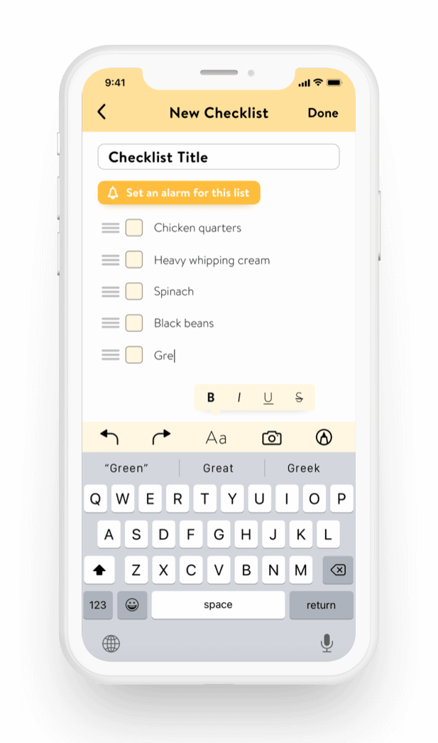
The app features three key functionalities: to-do lists, event planning, and personalized labels/filters.
Context
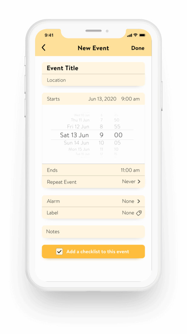
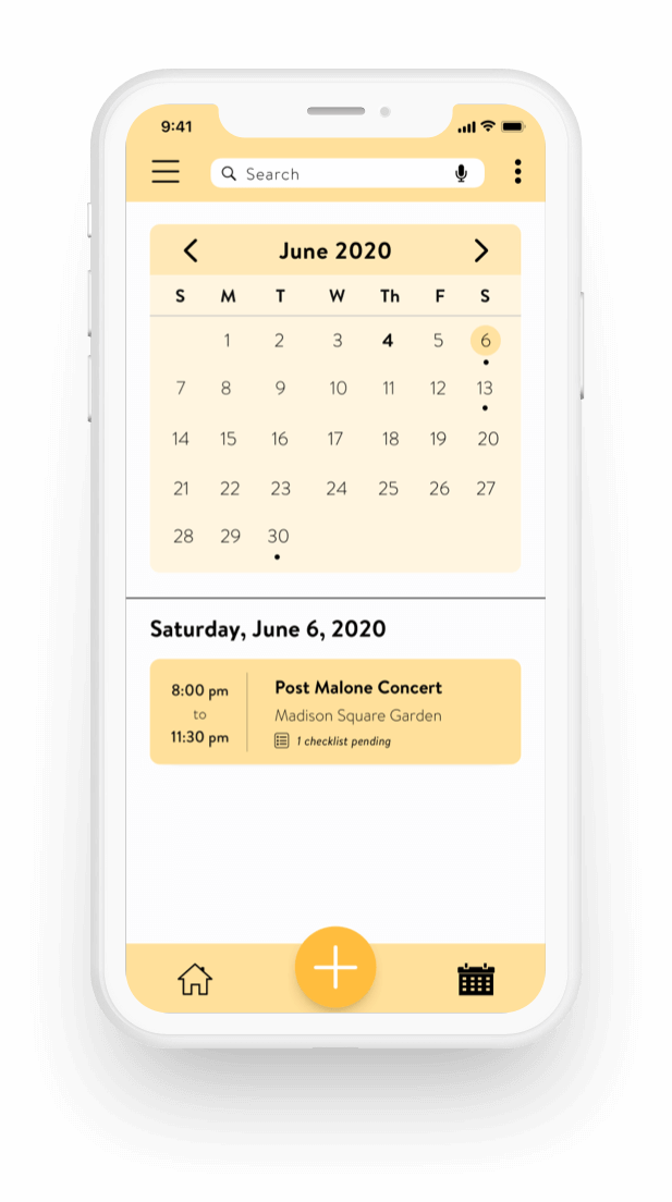
Busy Bee is a native mobile app that I developed for my UI Design certification. The project brief asked for a mobile user interface that is simple and engaging. With this in mind, I designed a clean and fun interface that invokes the feeling of happiness in users as they accomplish their goals.

Define Goals
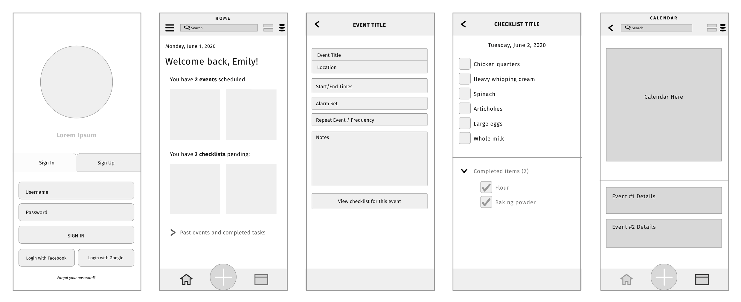
After completing a competitive analysis of existing productivity apps to identify pain points, I used Jakob Nielsen's usability heuristics of efficiency, learnability, and satisfaction to develop key functionalities and UI patterns for my mobile app.
Ideate - Wireframes
Visual Design
Color Palette
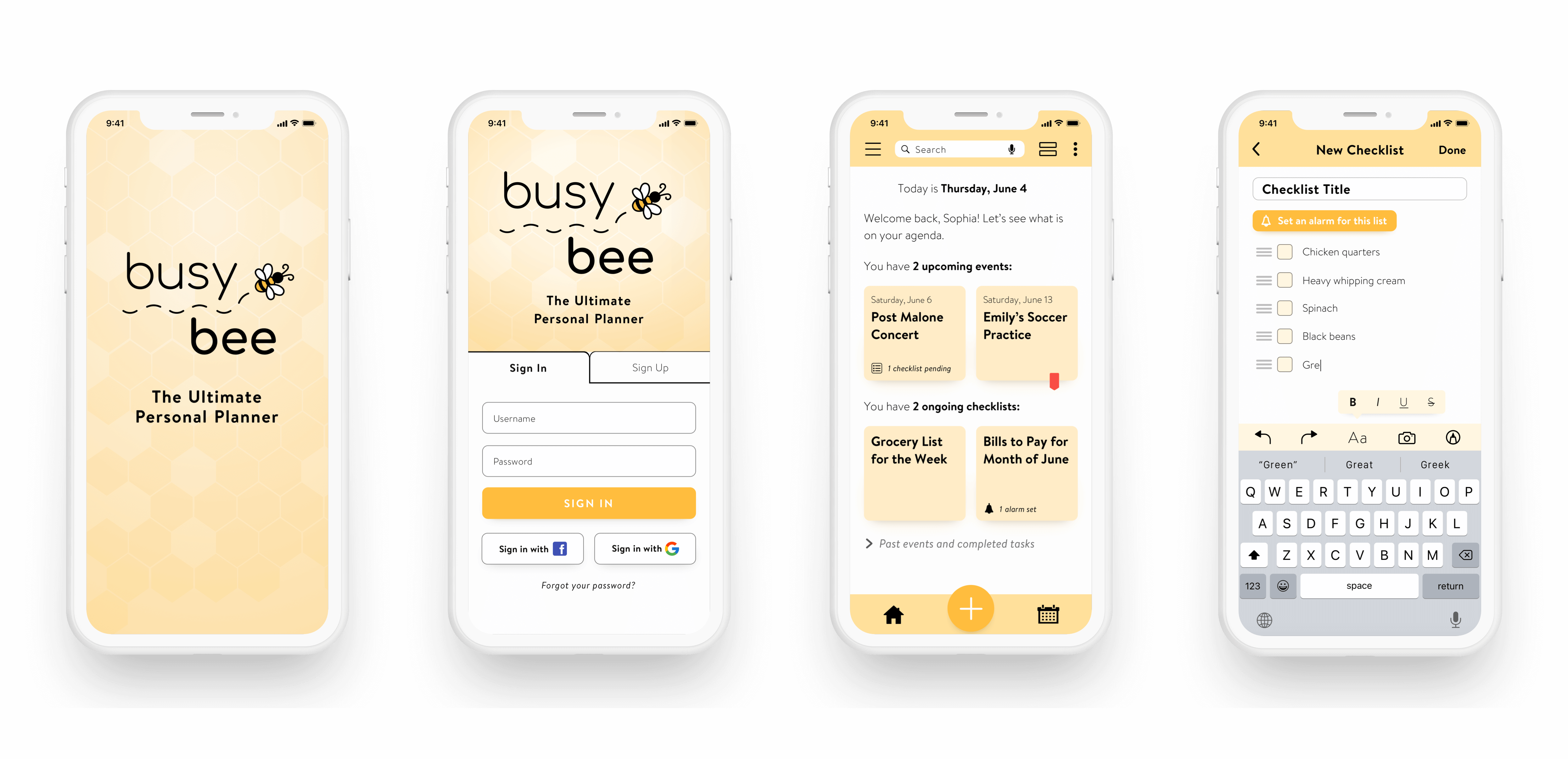
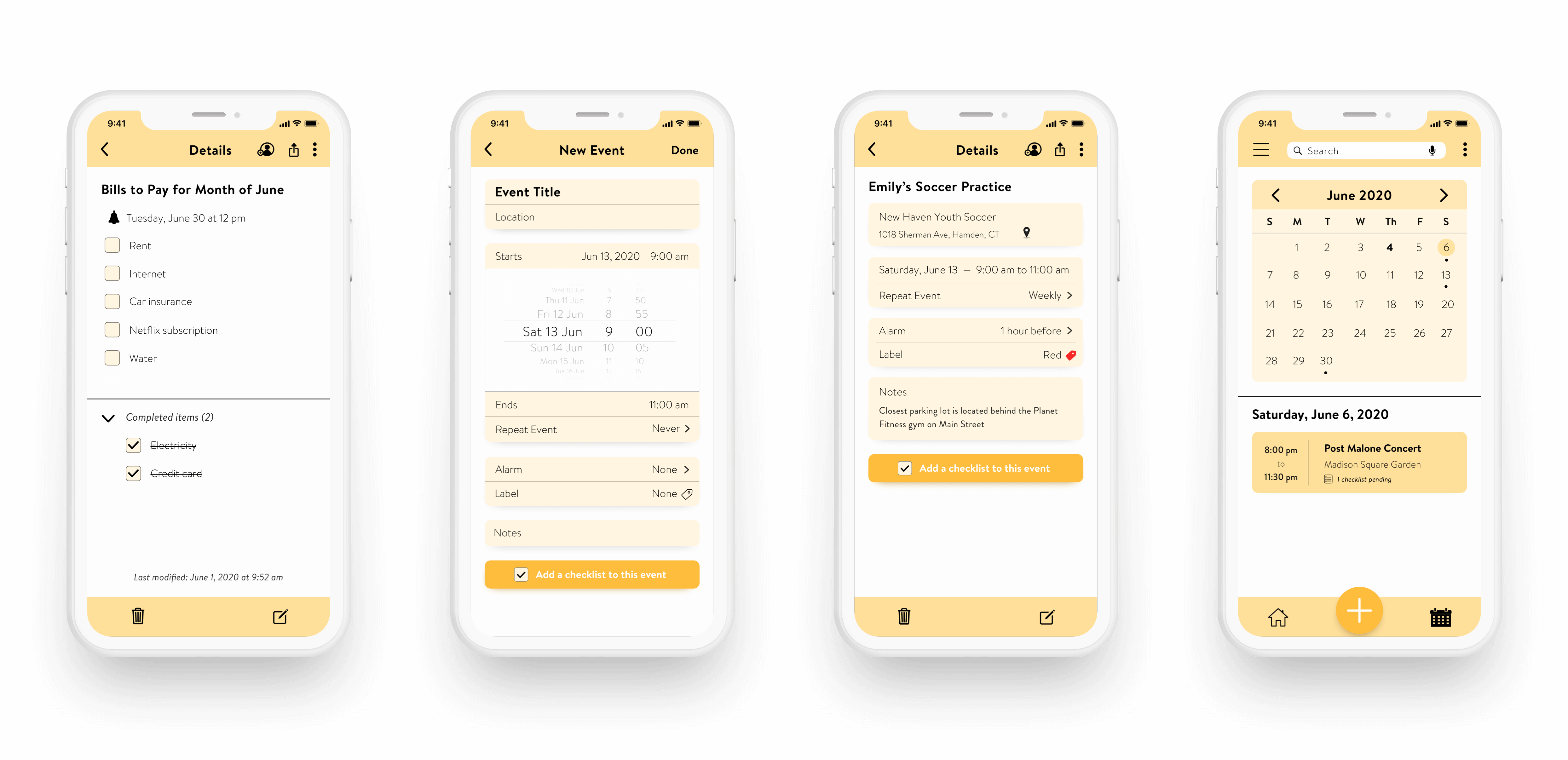
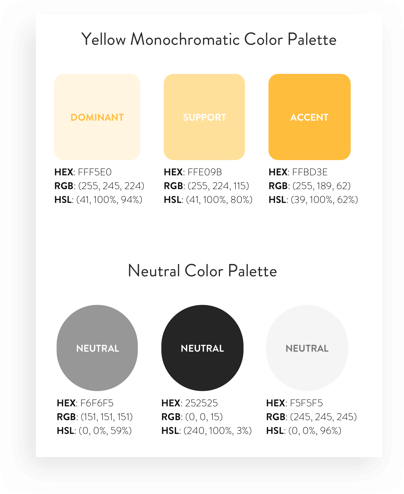
I used a yellow monochromatic color scheme because it's a color associated with happiness and vitality — feelings that I wanted users to experience while accomplishing their goals.
Since yellow can also be associated as a warning color, I selected subtle shades of yellow that were not intrusive.
A secondary color grey palette was used to complement the yellow color palette. These neutral colors were primarily used as headers and body text.
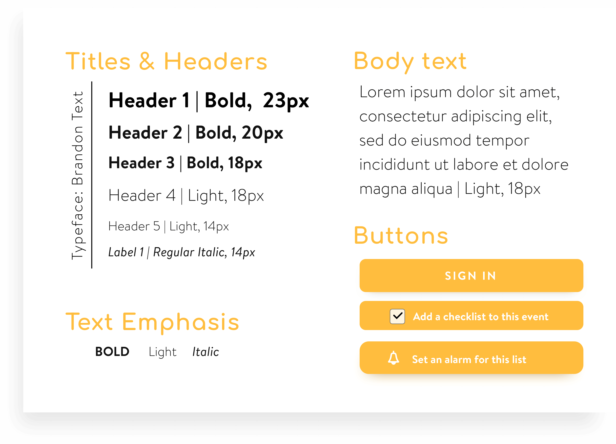
Typography
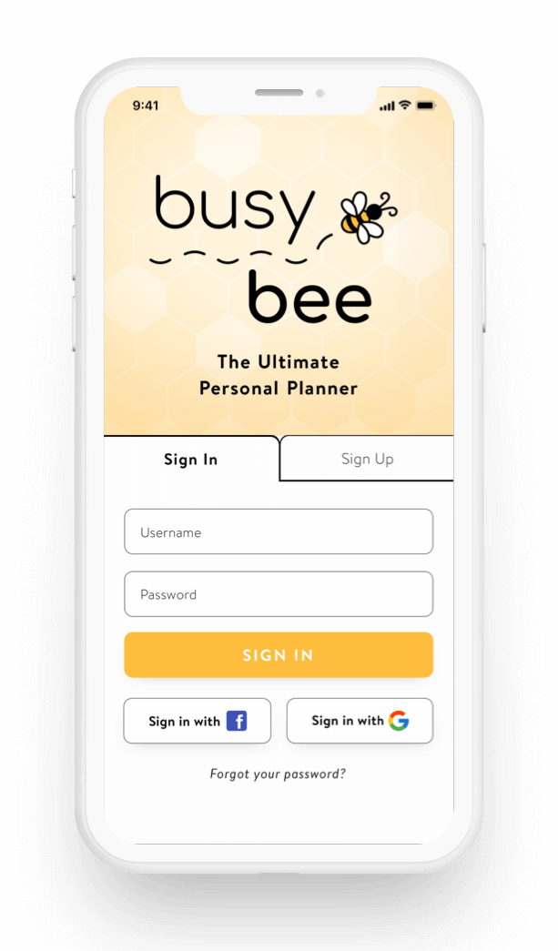
I used Brandon Text, a rounded terminal sans-serif typeface, for its friendly and playful style. This also complemented perfectly with the Comfortaa font used for the Busy Bee logo.
Final Showcase
