Role: UI/UX, Visual Designer
Timeline: 2 months (Aug - Sep 2020)
Tools: Sketch, InVision, UsabilityHub, Slack
Overview
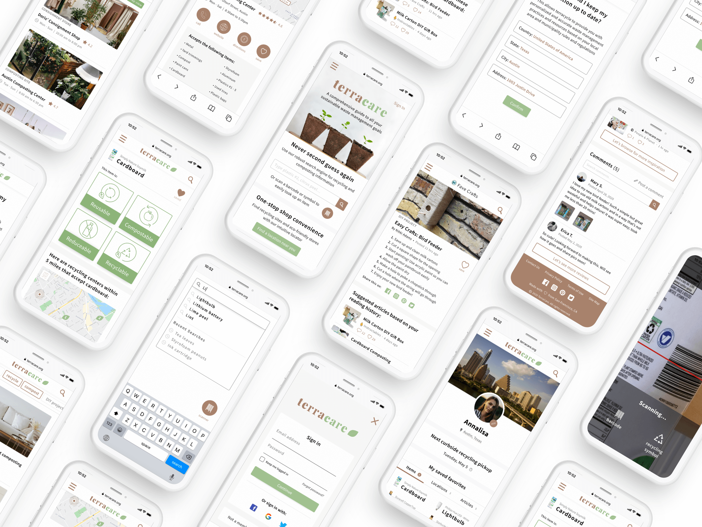
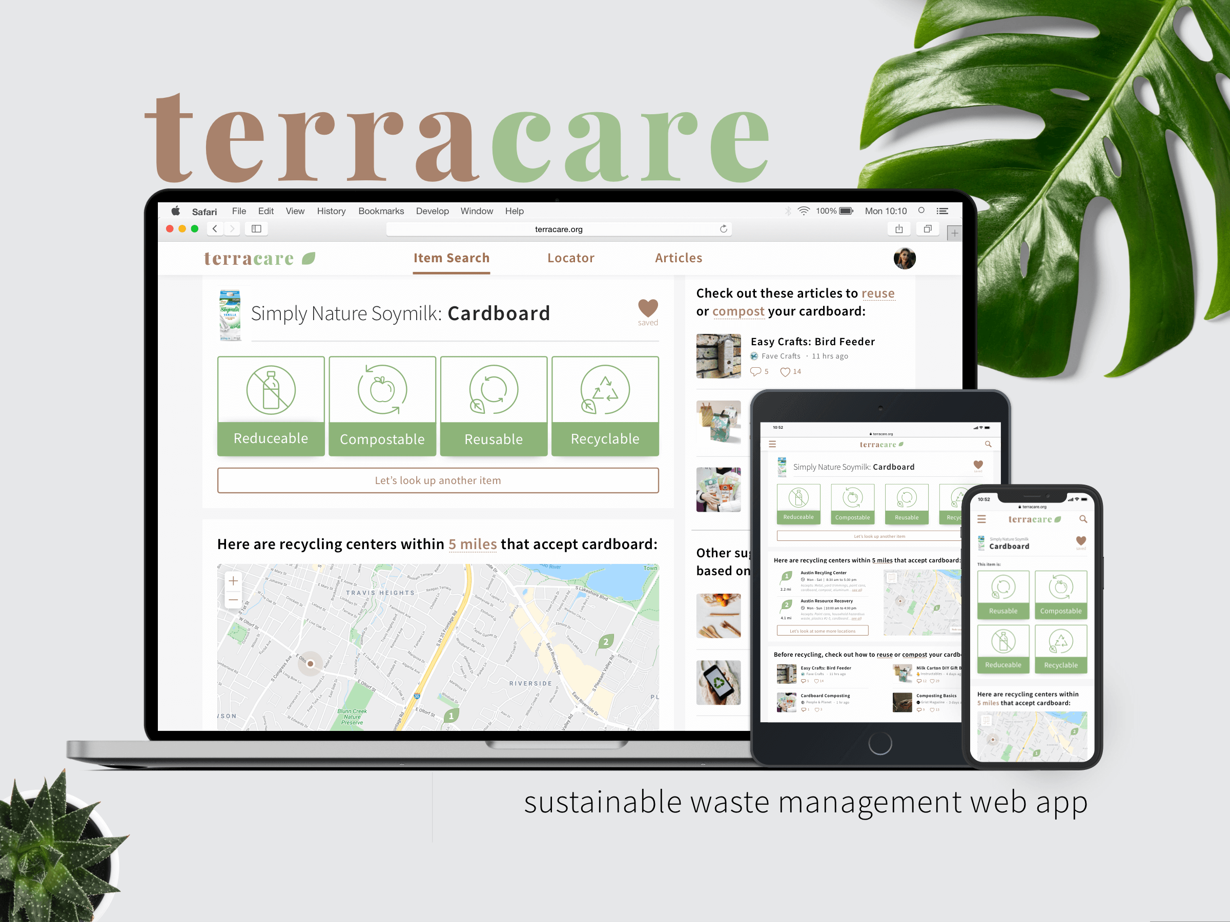
With so many different recycling rules depending on where one lives, it can get confusing sometimes to follow best practices for sustainable waste management. To address this problem, TerraCare was designed to take into consideration the user's current location to provide simple, accurate, and personalized information.
It features 3 key functionalities: an intuitive search engine for items, a locator feature to find recycling centers/eco-friendly stores nearby, and useful articles/blogs geared towards every user's unique sustainable waste management goals.
Context
TerraCare is a sustainable waste management web app that I developed, from conception to execution, for my UI Design certification. The goal of the project was to design responsive screens that would function well and look beautiful across all breakpoints and devices. It also needed to follow conventional web app structure and considerations.
Competitive Analysis
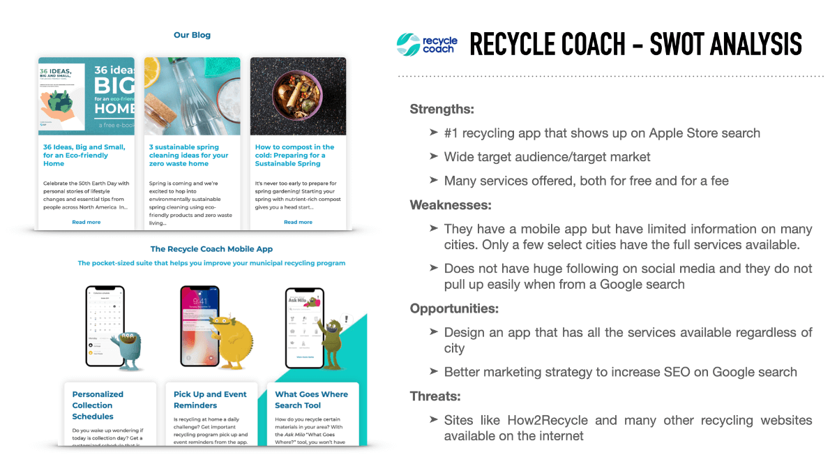
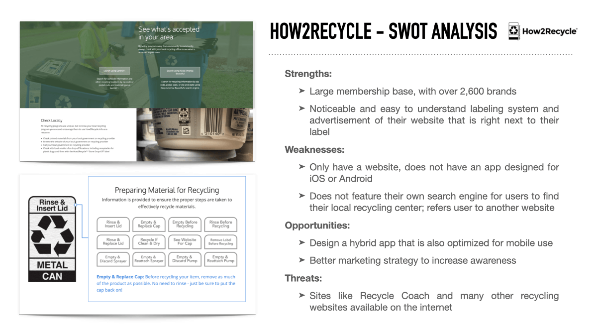
The first step in my design process was to research similar sustainability apps currently in the market. This will allow me to identify their strengths and opportunities for my own app. I did an analysis of two competitors: RecycleCoach and How2Recycle.
User Personas
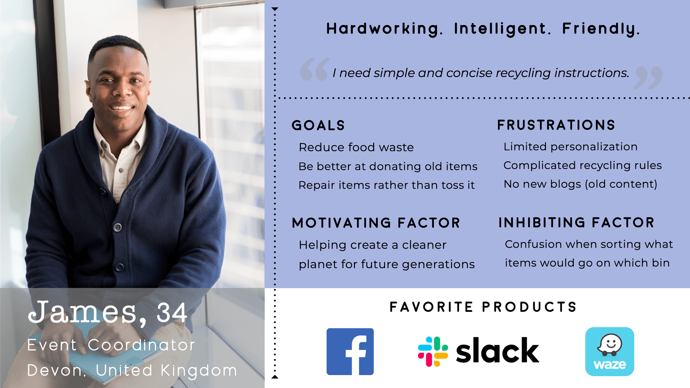
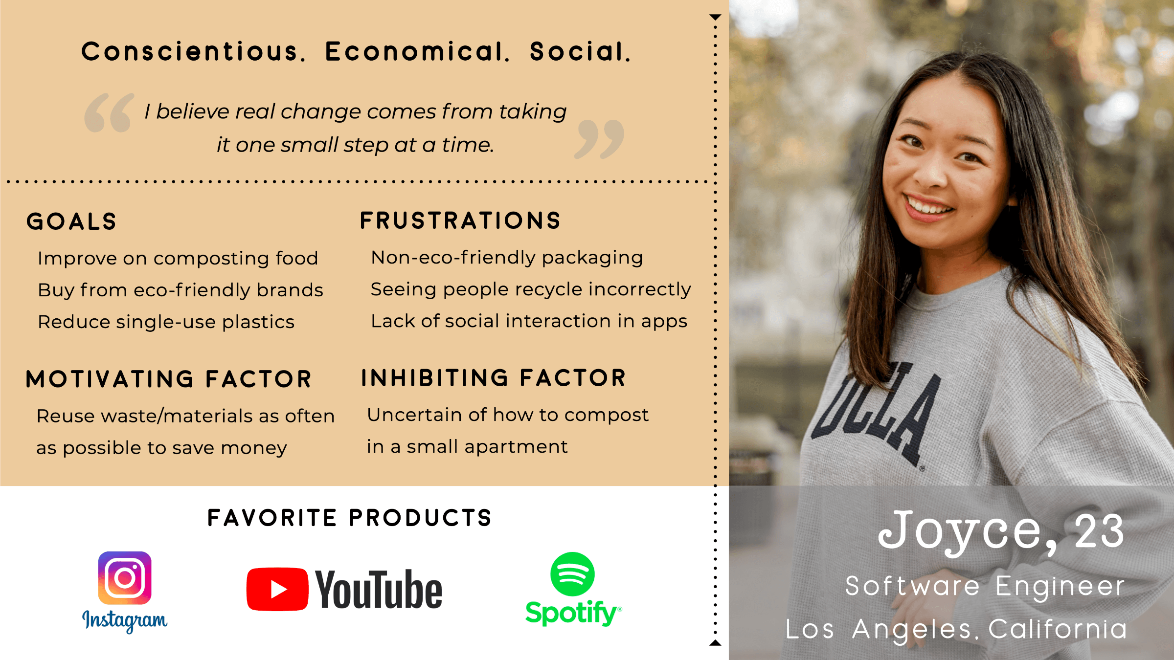
After completing a competitive analysis, I recruited and interviewed 5 people from the Slack community who were interested in sustainable living in order to better understand their needs and goals. I then created user personas based on my user research that helped me paint a clear and realistic picture of users’ goals, needs, and behaviors.
Minimum Viable Product
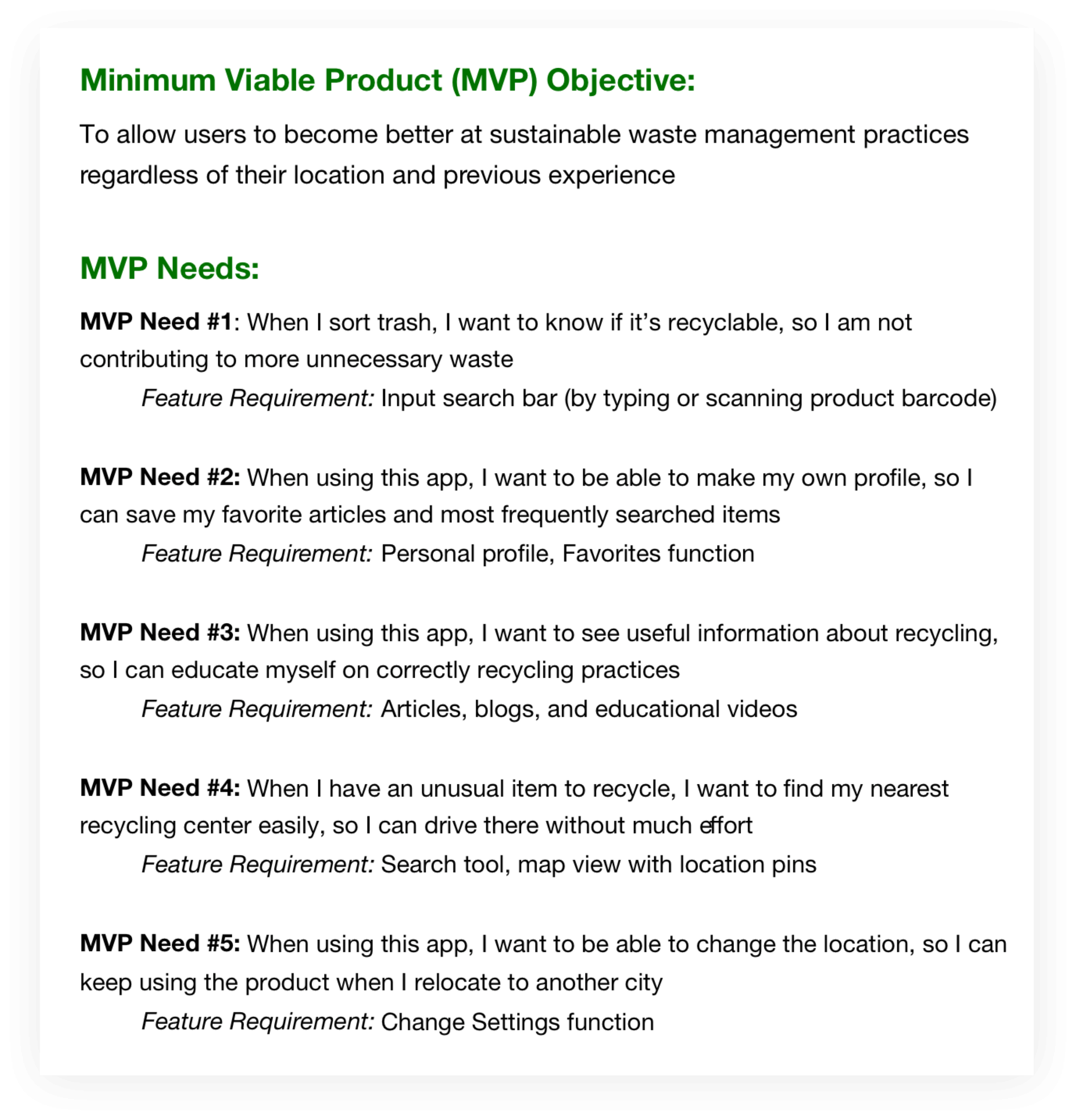
Next, I gathered requirements to define what features I needed to design for my app. I developed key user stories (from my personas) and minimum viable products (MVPs).
The MVPs would allow me to quickly test my initial designs on users, giving me valuable feedback early in the design process and to address any concerns right from the beginning.
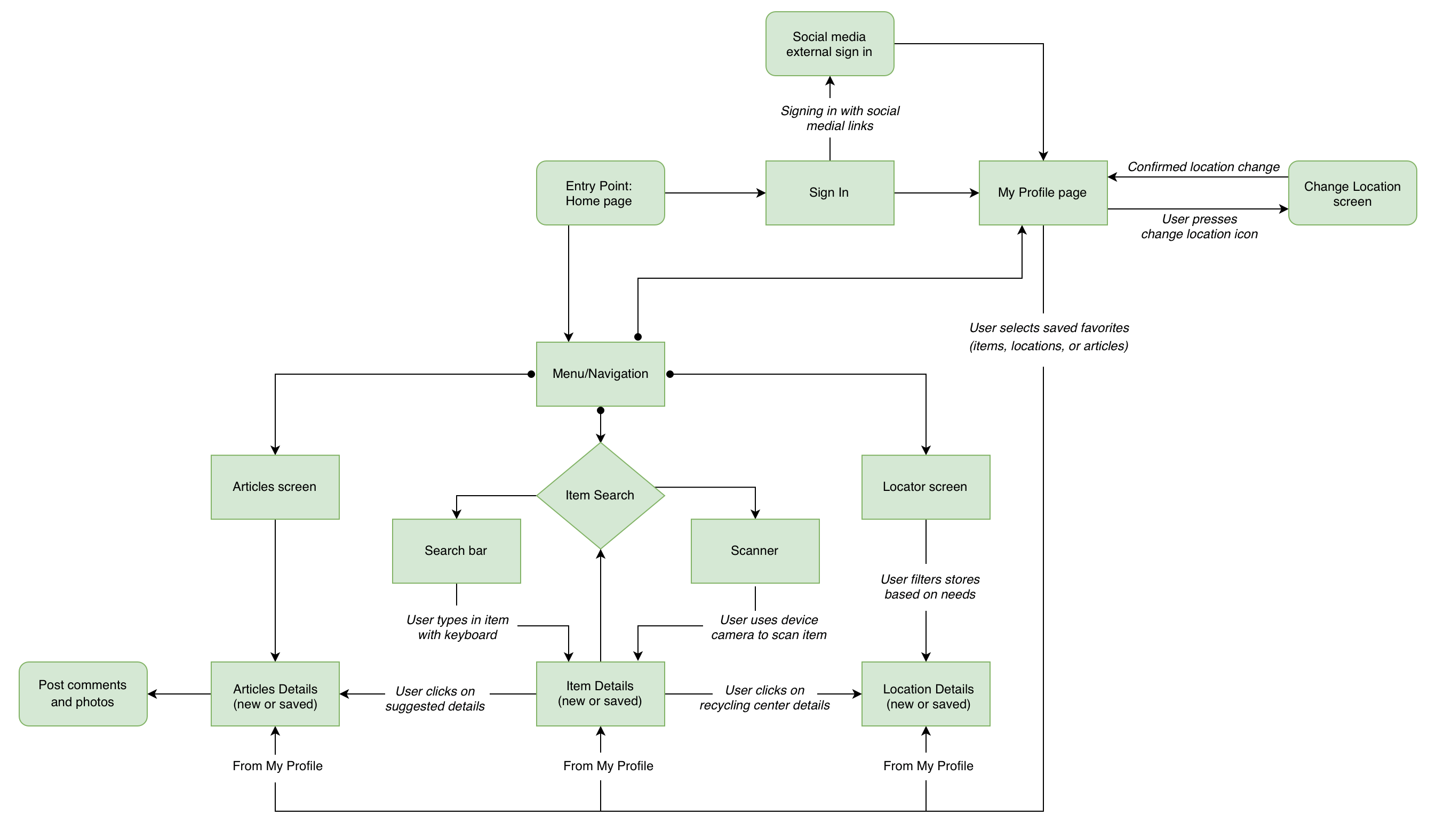
User Flow Diagram
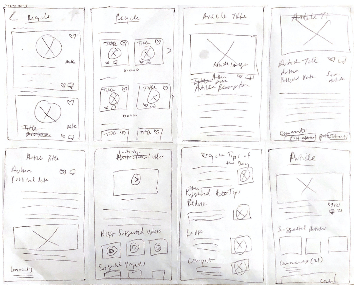
Crazy 8's Wireframe
Using my user personas, user flows, and MVPs as a guide, I sketched out wireframes using the Crazy 8's method. After multiple sessions, I picked the designs that I felt addressed the MVP goals the best, and converted them to prototypes in InVision.

Prototype

User Testing
Usability Testing
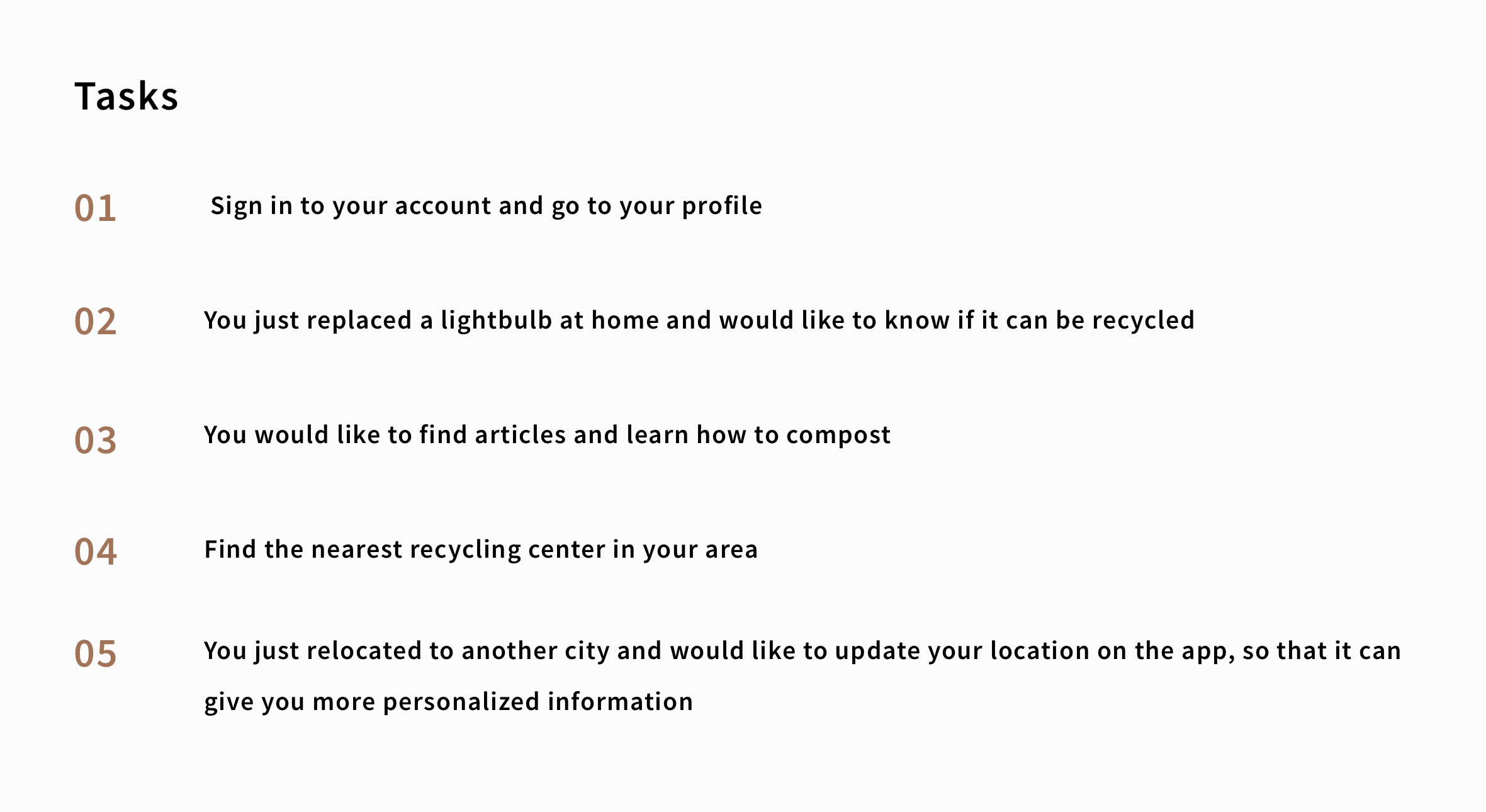
Using my prototypes, I recruited 5 participants from the Slack community to conduct remote moderated usability testing on my designs. During the test, I asked them to complete a series of tasks that helped me to understand their thought process and see if they could accomplish the MVP goals. This was also the perfect time to ask about their likes and dislikes of the prototype.
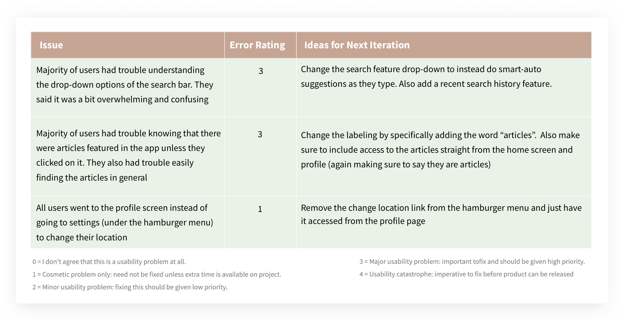
After the user interviews, I synthesized and ranked my observations into concrete issues using Jakob Nielsen’s error severity rating system. This helped me prioritize and understand the most important pain points and propose new solutions for my designs and ideas for my next iteration based on the results.
Preference Testing
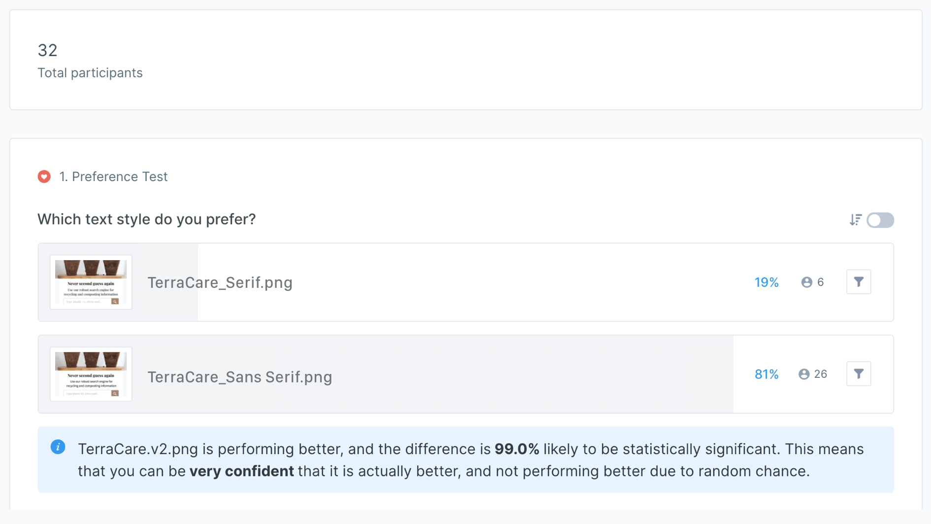
Using UsabilityHub, I also conducted Preference testing to determine which typography style was preferred by users. With an 81% overwhelming majority, users voted that they liked the design to have a san-serif font over serif font, as it was more readable and matched the tone of an eco-friendly app better.
Design System
8-Point Grid
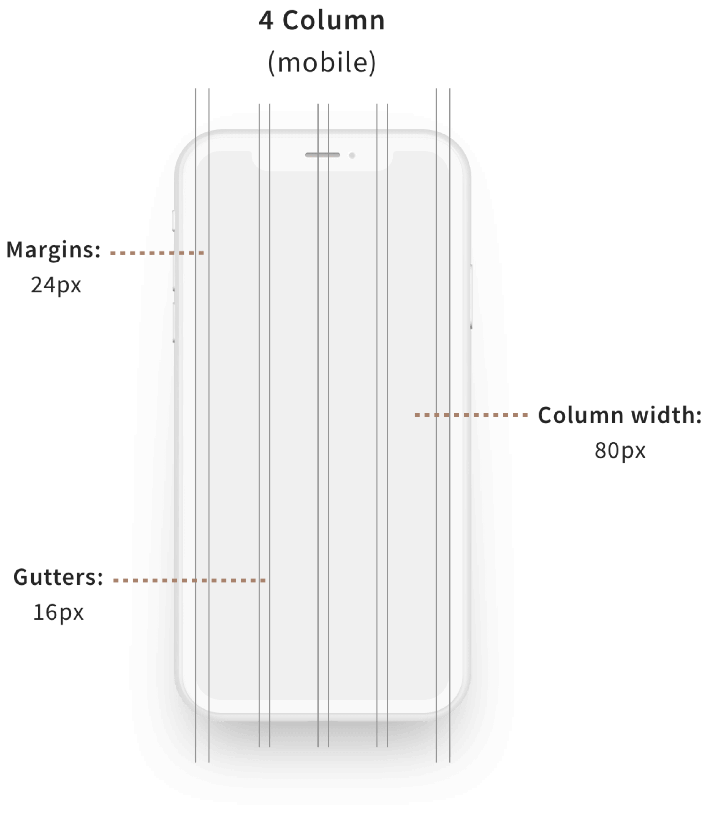
The first step was to lay the foundation of TerraCare’s design system by establishing the grid that the screens will live on.
With a mobile-first approach, I designed using a 4-column and 8-point grid system. This helped me define the spacing system which was also later used to set typography and iconography measurements.
Incorporating this essential step helped to create an exceptional user experience as I defined and adhered to the design standards. It ensured consistency of design and assisted in the expression of TerraCare’s unique personality and brand.
Typography
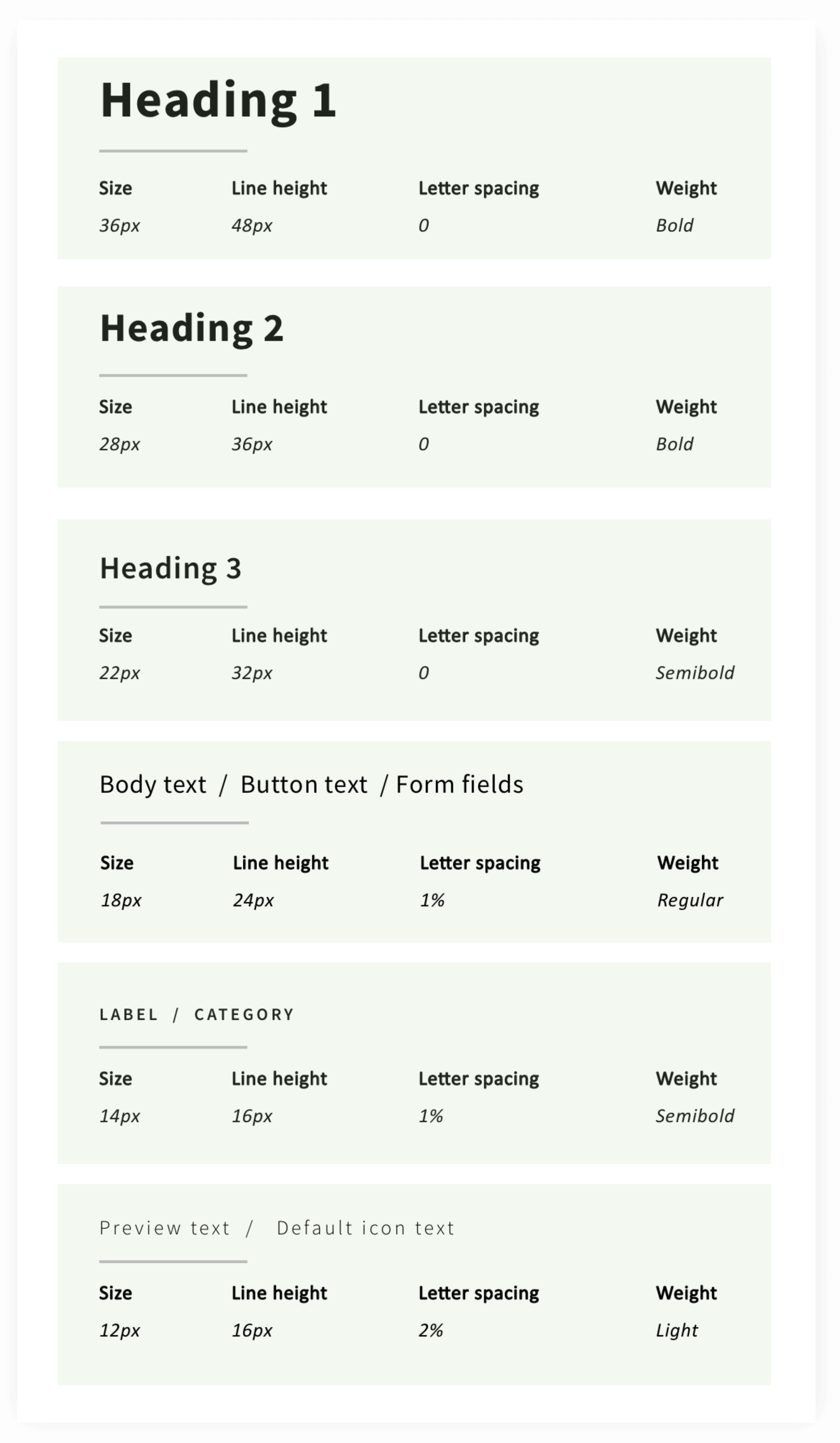
Source Sans Pro, a sans-serif typeface, was used across the brand to showcase a clean and modern look and feel as well as provide easier readability.
For typography measurements, I based the font size on a defined type scale (1.250 - Major Third) but still used a 8px system for the line height. Using a type scale ensured a harmonious scale that was pleasing for users and scalable for web development.
Color Styles
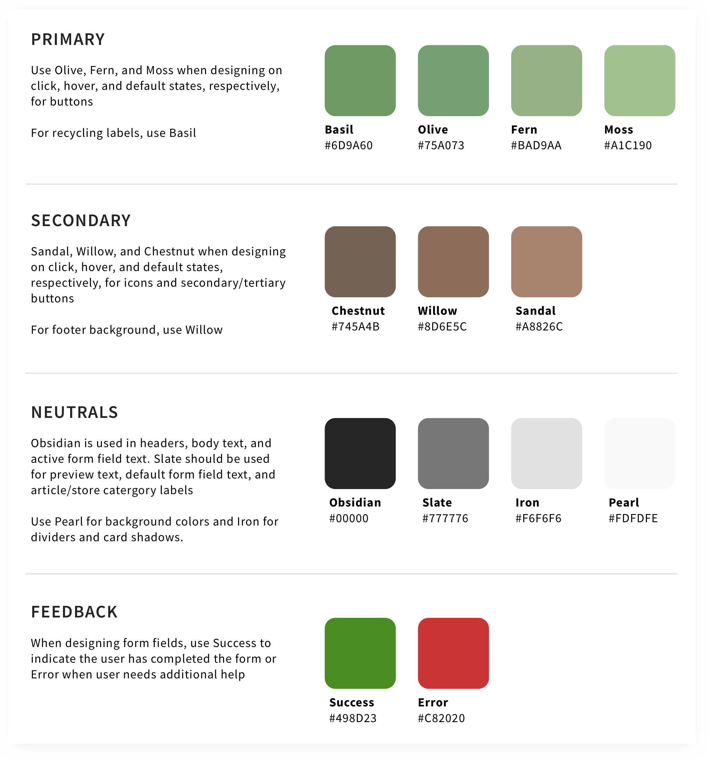
The primary palette was comprised of green shades and tints to bring in a sense of nature and eco-friendliness to the brand.
Brown was peppered in as a secondary palette to ground the whole product, providing contrast and an earthy tone. Neutral colors were also used to add a touch of contemporary look and feel.
To create a light-hearted and on-brand color naming system, I took inspiration from organic materials found in nature.
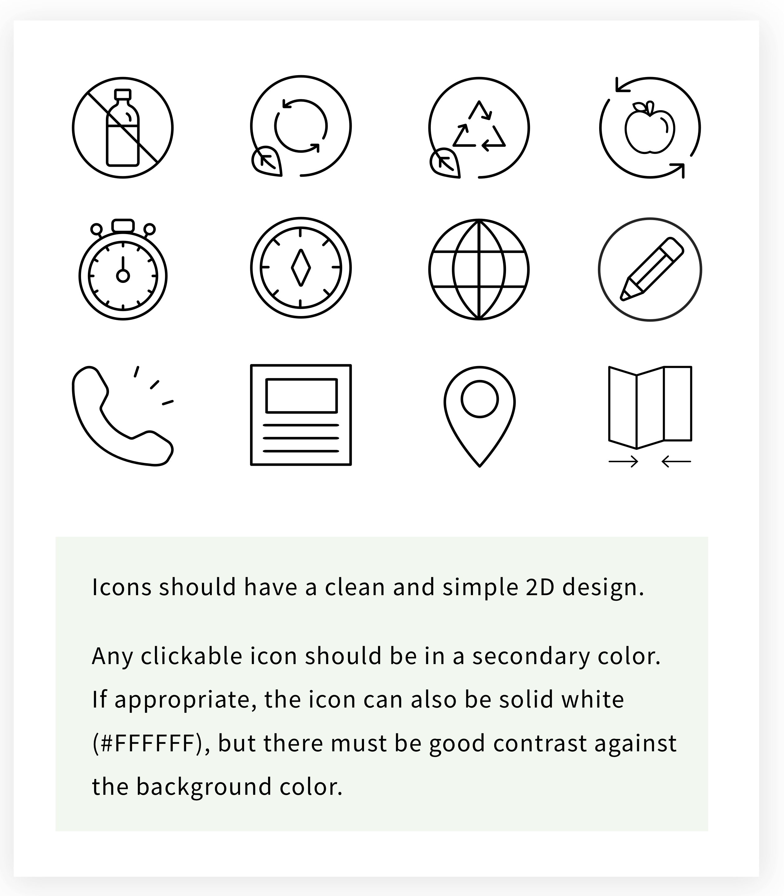
Iconography
Like the typography, I used the 8px grid system for the iconography as well.
I sized the icons proportionally, with the height as a multiple of 8. I used 16px, 24px, 32px, and 48px.
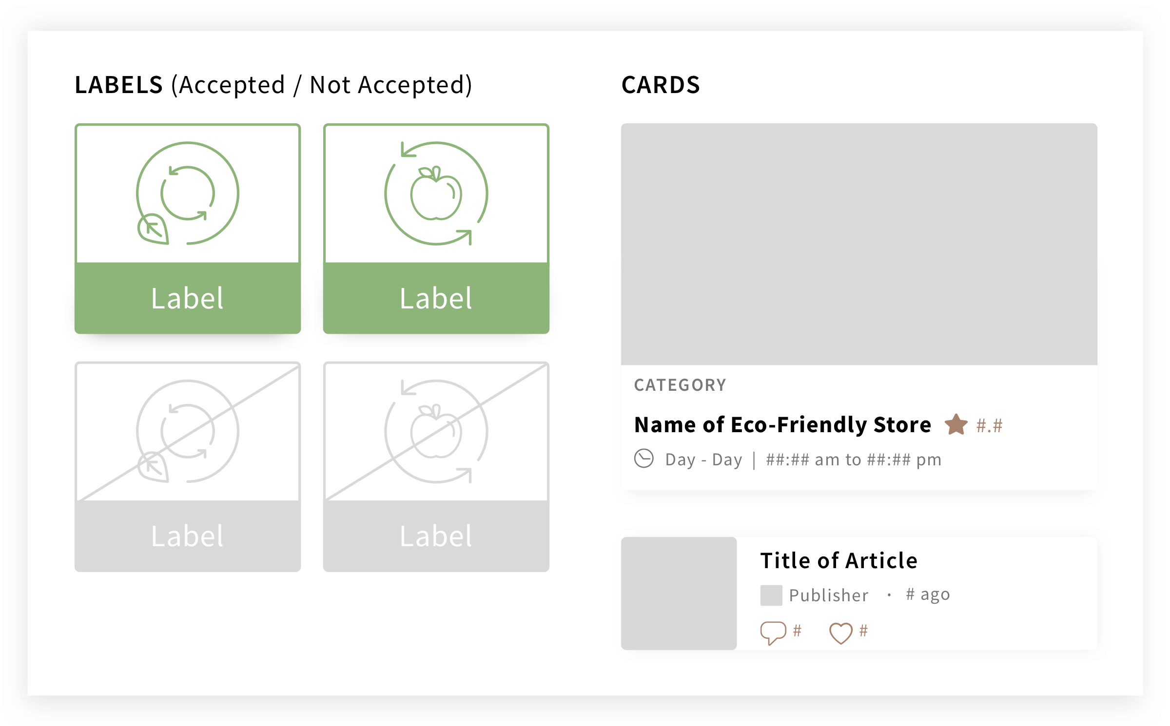
UI Components
Following the color styles, I designed UI components that would later assist in building pages in a consistent and effective manner.
Photography

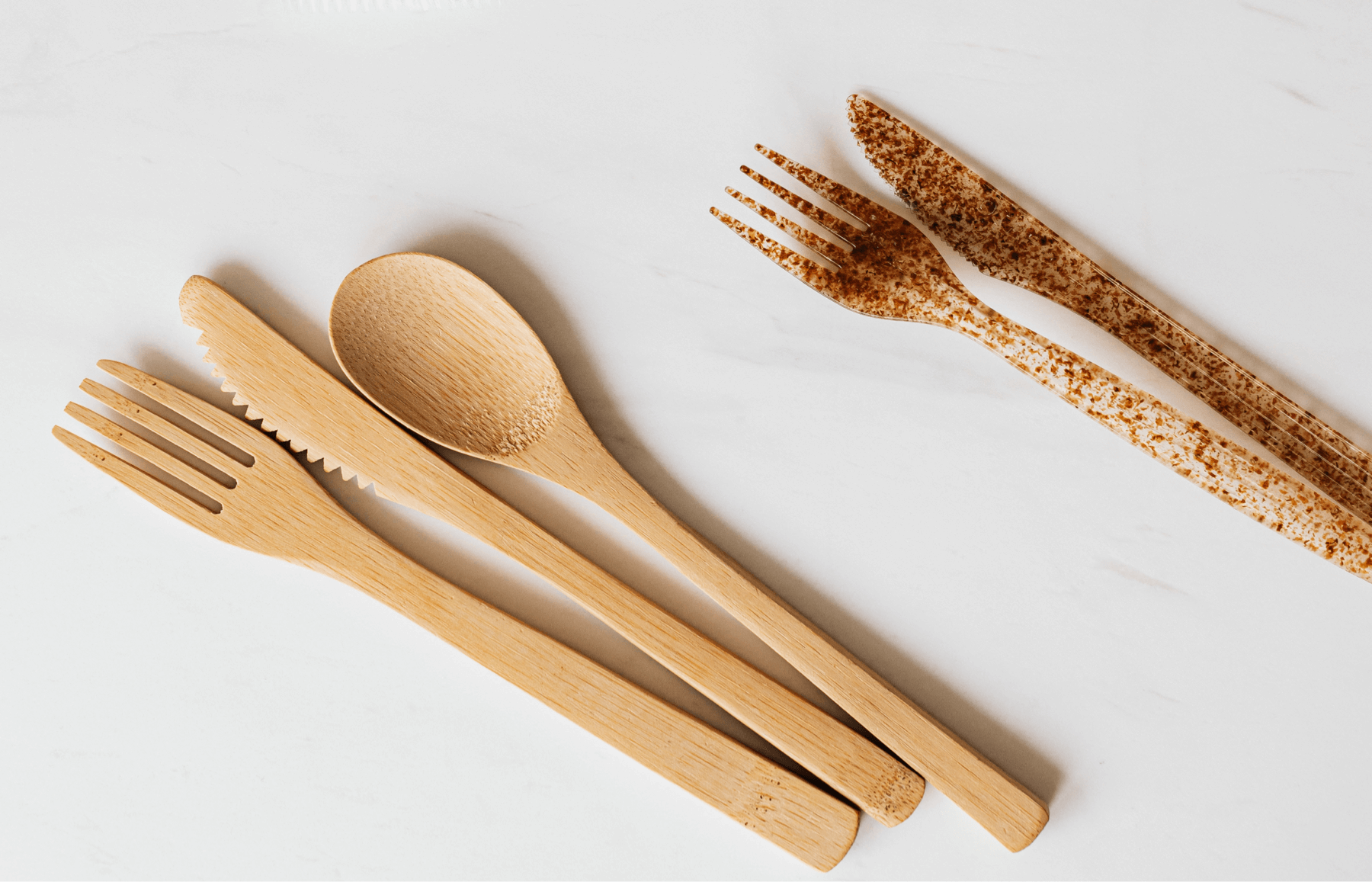
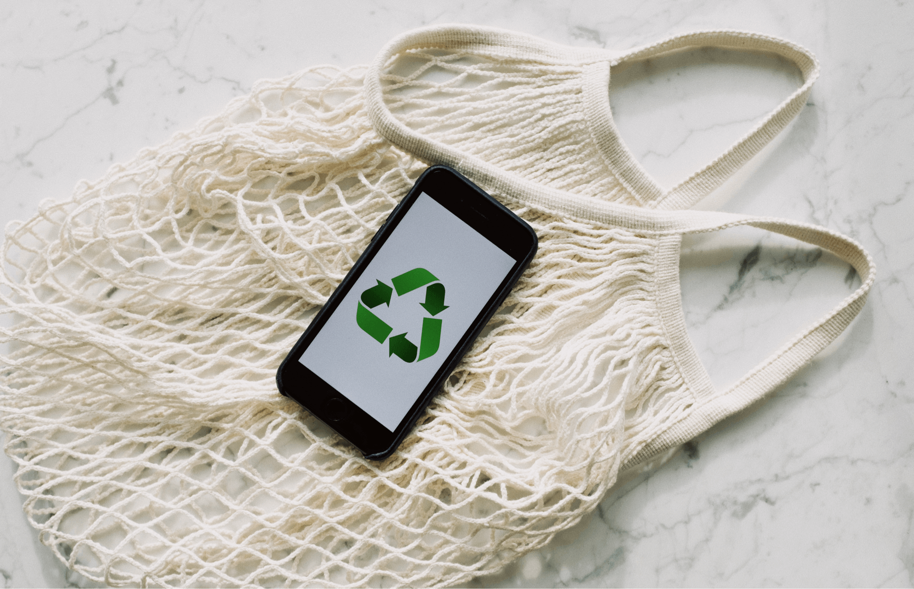
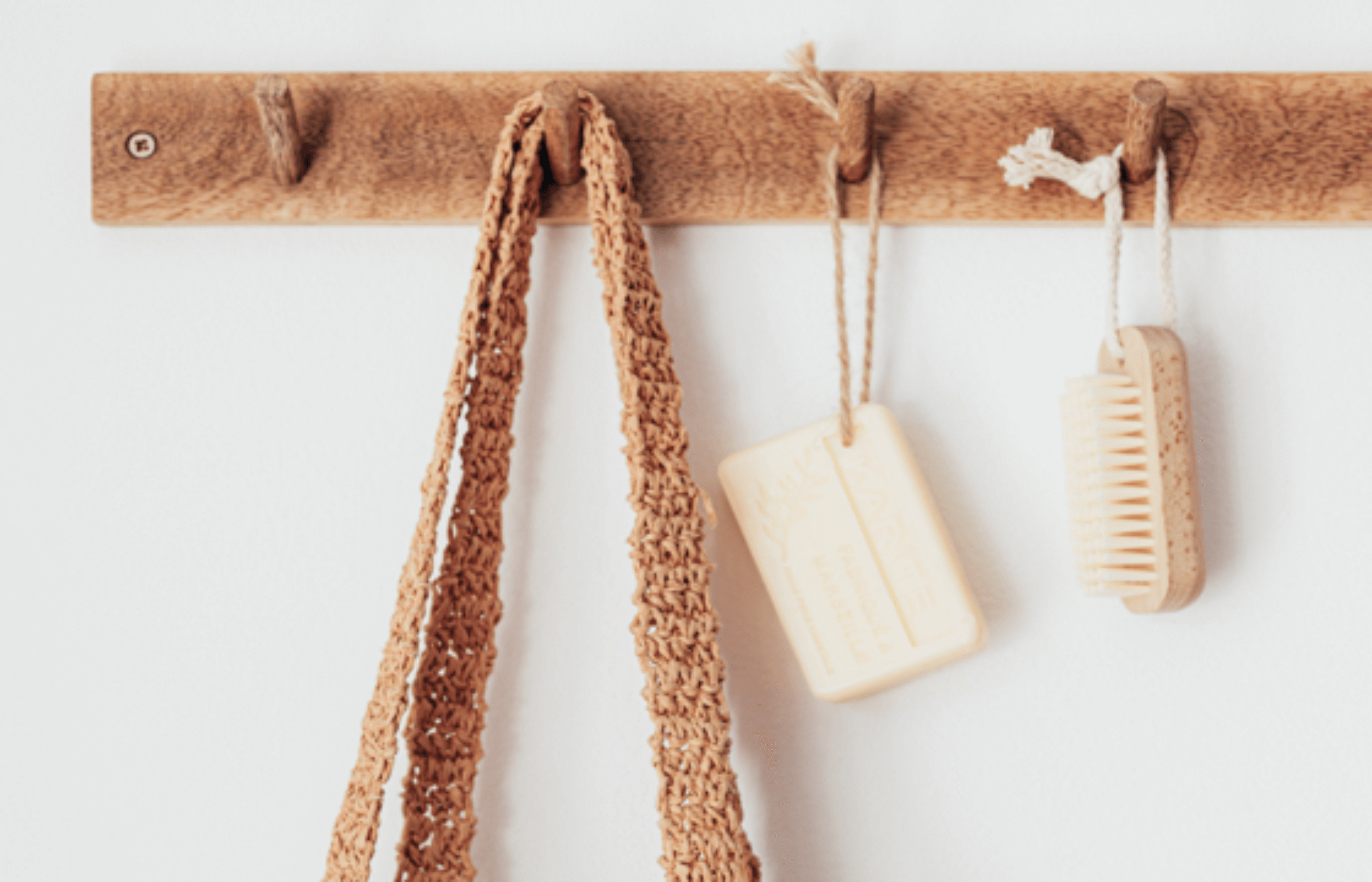
For images, I used a 16:9 ratio and set the width to the layout grid. For this reason, the image’s height does not follow the 8px grid system.
All photos used for articles should be of high resolution, with the main subject of the topic shot up close. They should ideally feature topics that promote sustainable living. The colors of images should aim to have neutral or earth tones with a minimalist style.
Final Showcase
