Role: UX/UI, Interaction Designer
Timeline: 5 weeks (Oct - Nov 2020)
Tools: Figma, Sketch, InVision, Slack
Overview
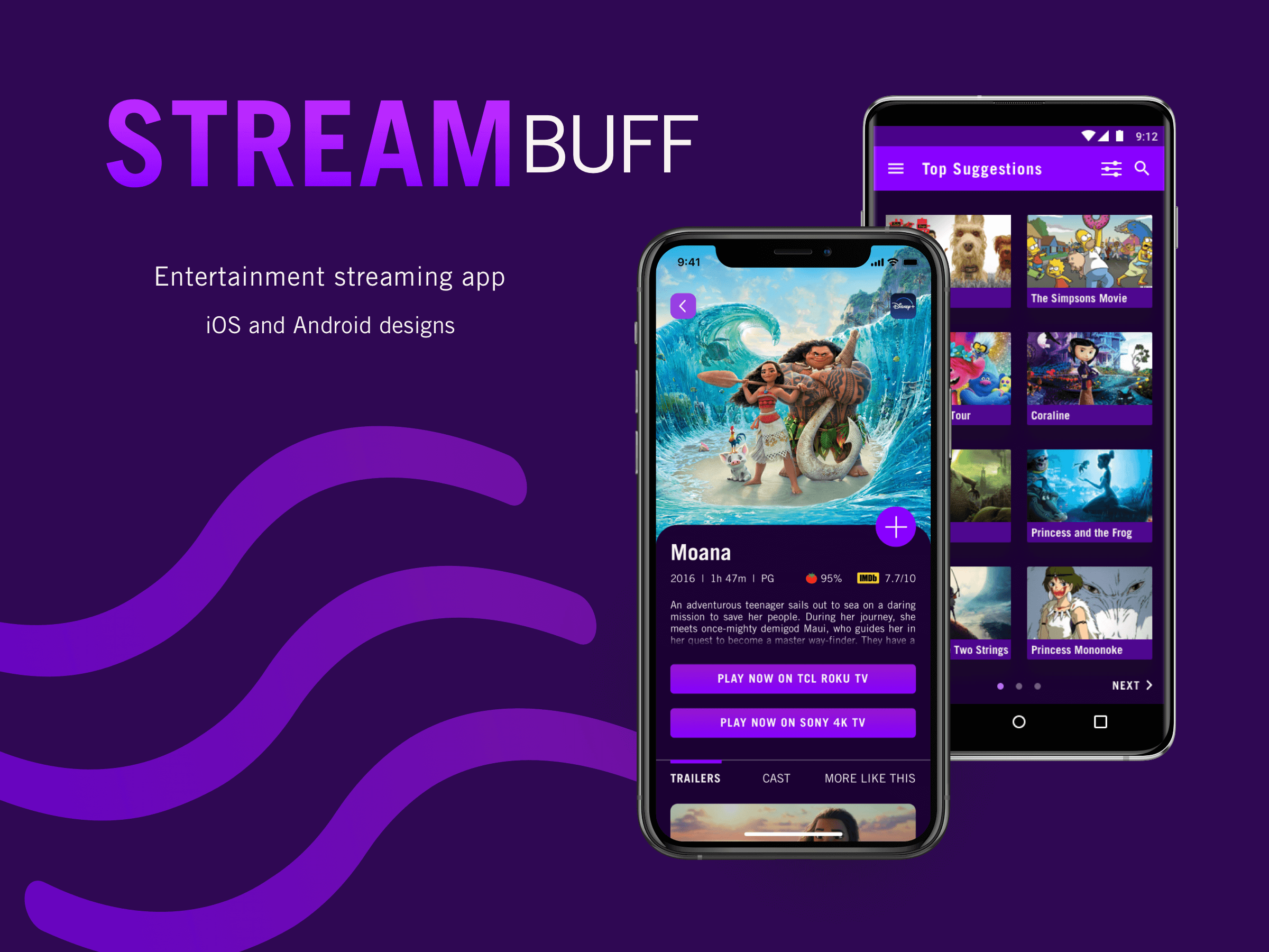
With so many amazing movies and shows available to watch out there — and on so many streaming services — it can be difficult to pick what to watch. In comes StreamBuff, an app that will quickly help find the perfect movie or show based on one’s interests. Cheers to no more endless browsing on Netflix!
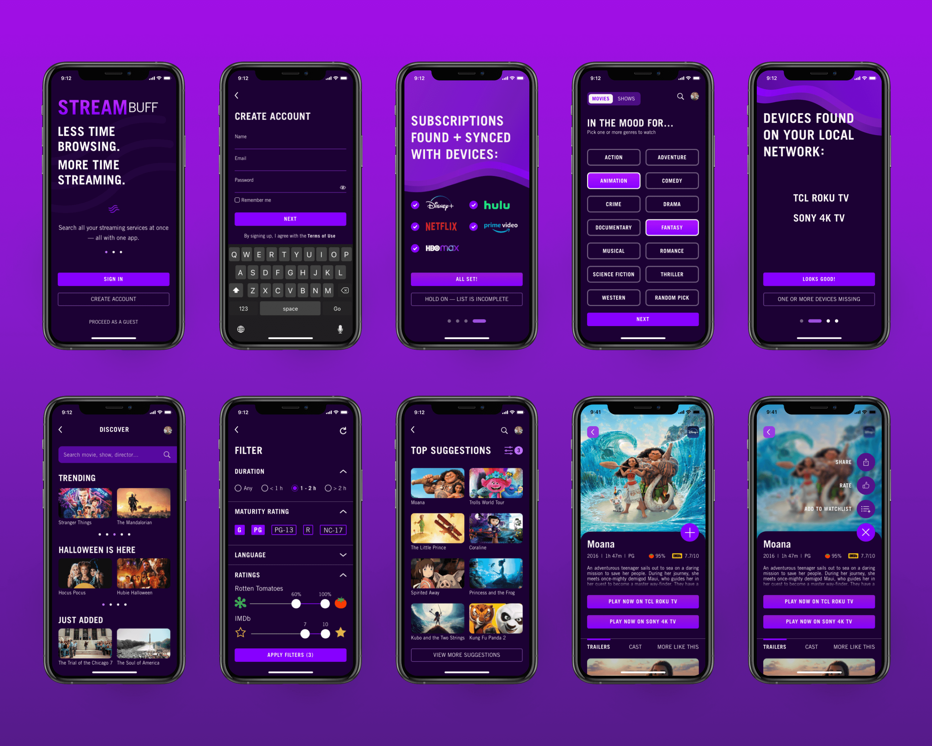
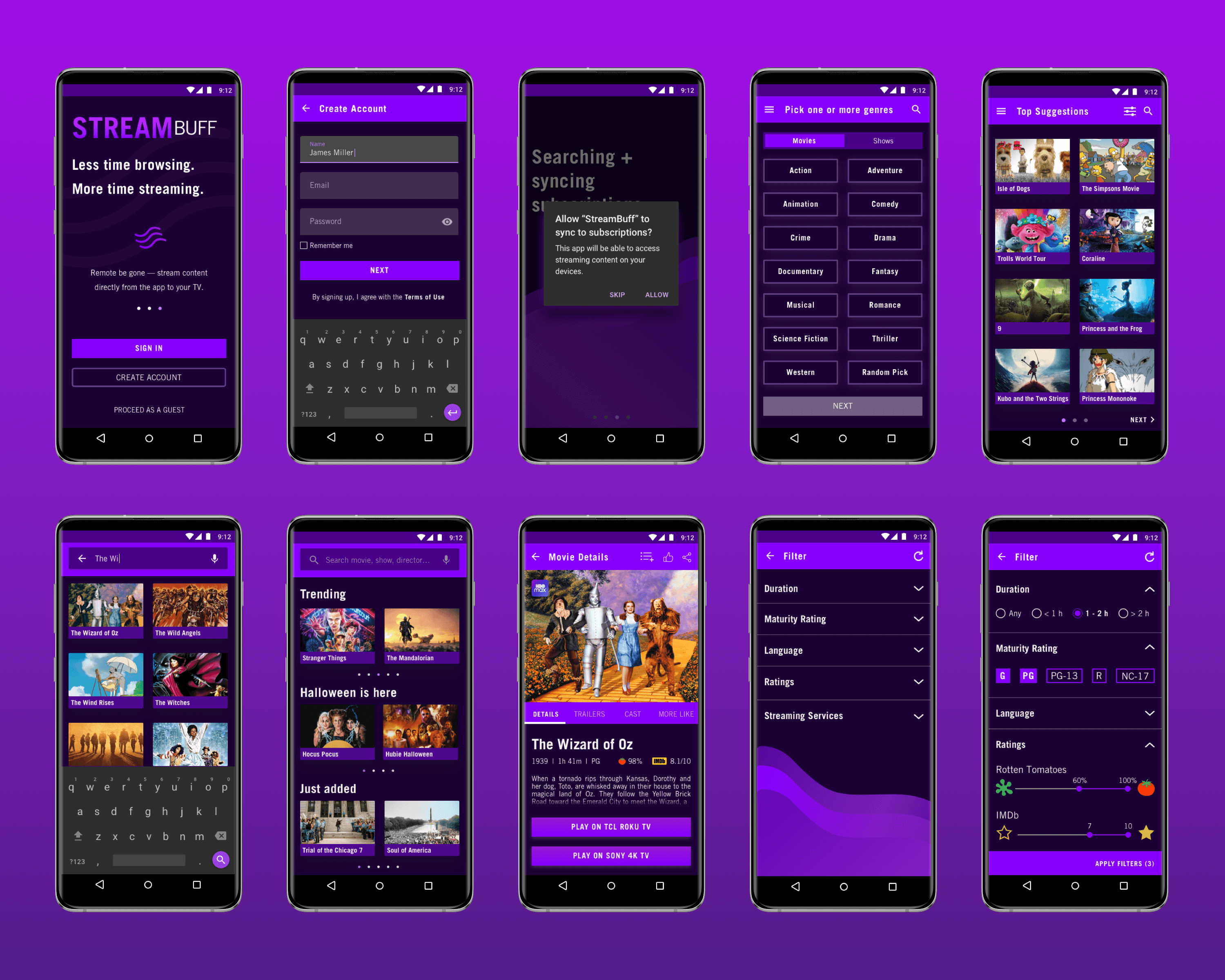
StreamBuff features 3 key functionalities: comprehensive search of all available streaming services at once, custom movie and show suggestions based on user’s preferences, and direct streaming capabilities straight from the app to the desired TV.
Context
StreamBuff is an entertainment streaming app that I developed, from conception to execution, for my UI Design certification. The goal of the project was to design both iOS and Android versions of a mobile app, while following iOS and Material Design guidelines as well as conventional mobile design patterns.
Design Process
Research
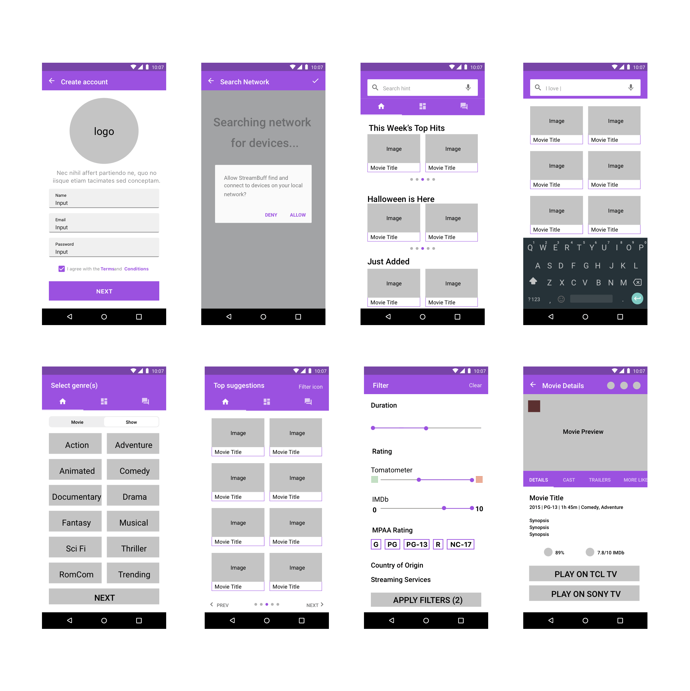
Before sketching out wireframes, I first did an in-depth analysis of existing apps, focusing on the use of UI elements and patterns as well as interactivity. I analyzed 3 similar apps that provide suggestions to users on what to watch: Taste, Flexi, and Dinggo. I also analyzed popular streaming apps (like Netflix, Hulu, and HBO Max) since one of my key screens features details of the selected movie or show such as trailers, synopsis, and ratings.
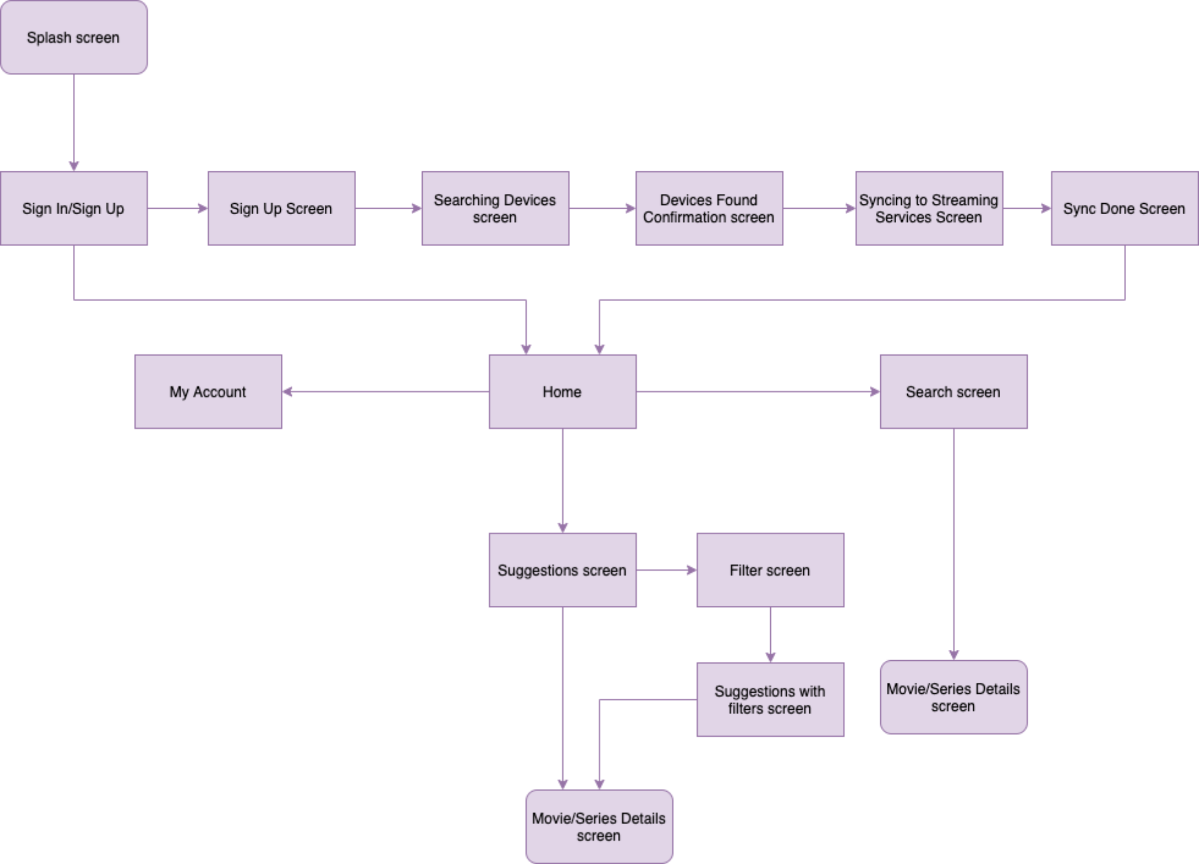
User Flow
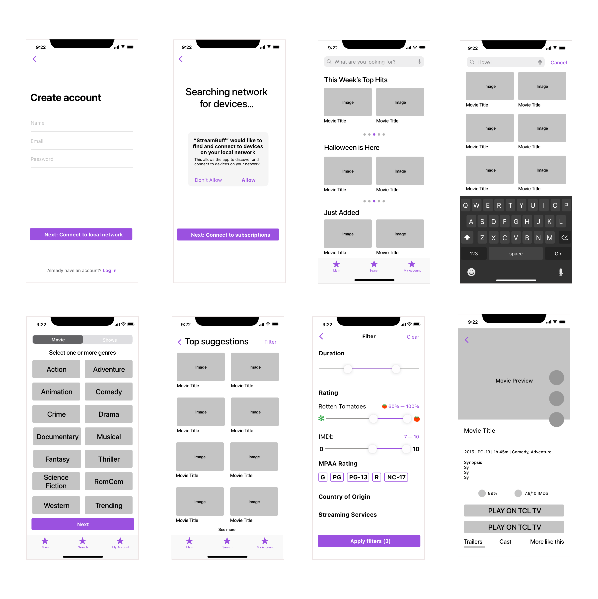
Wireframes
iOS
Android
Style Guide
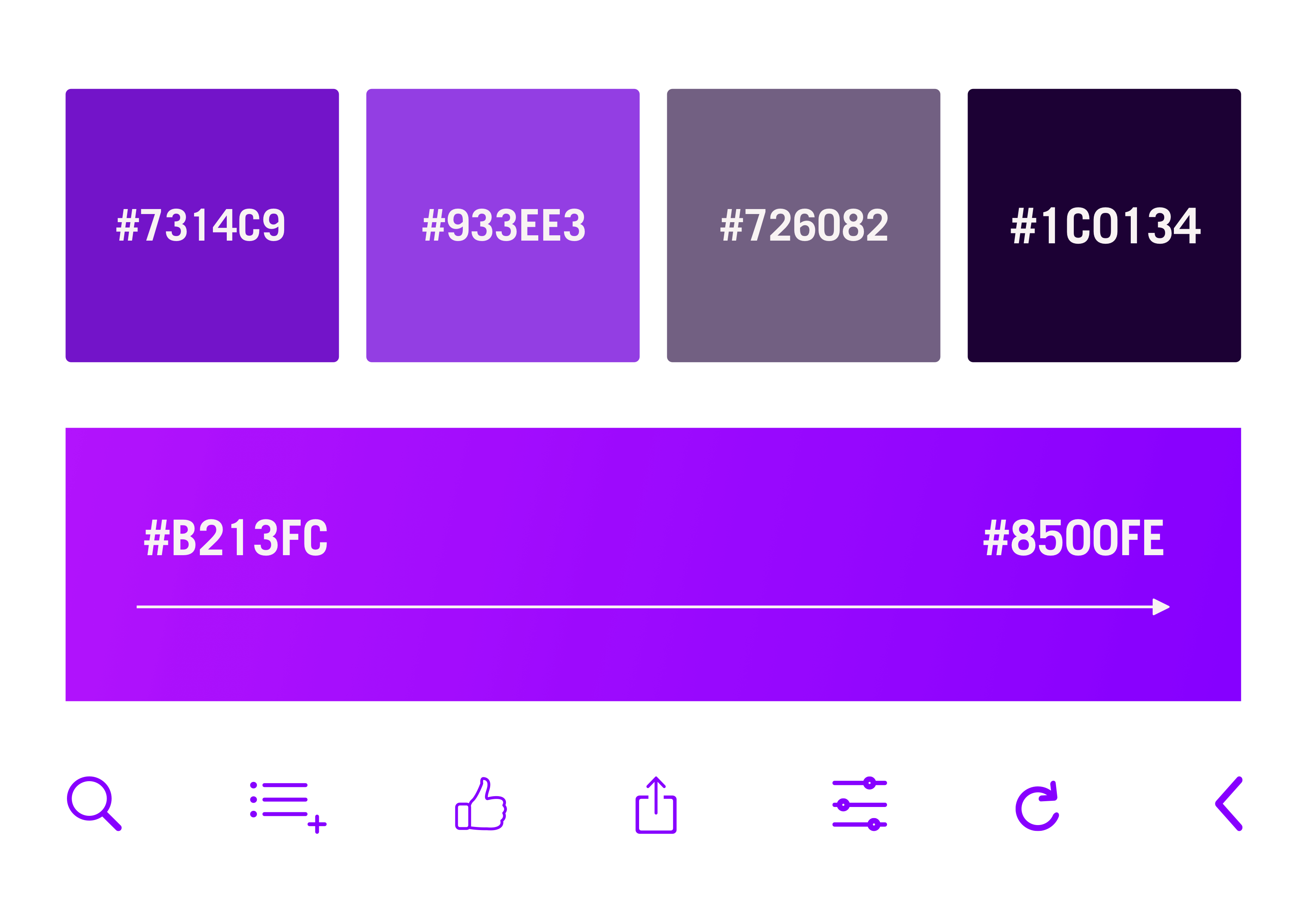
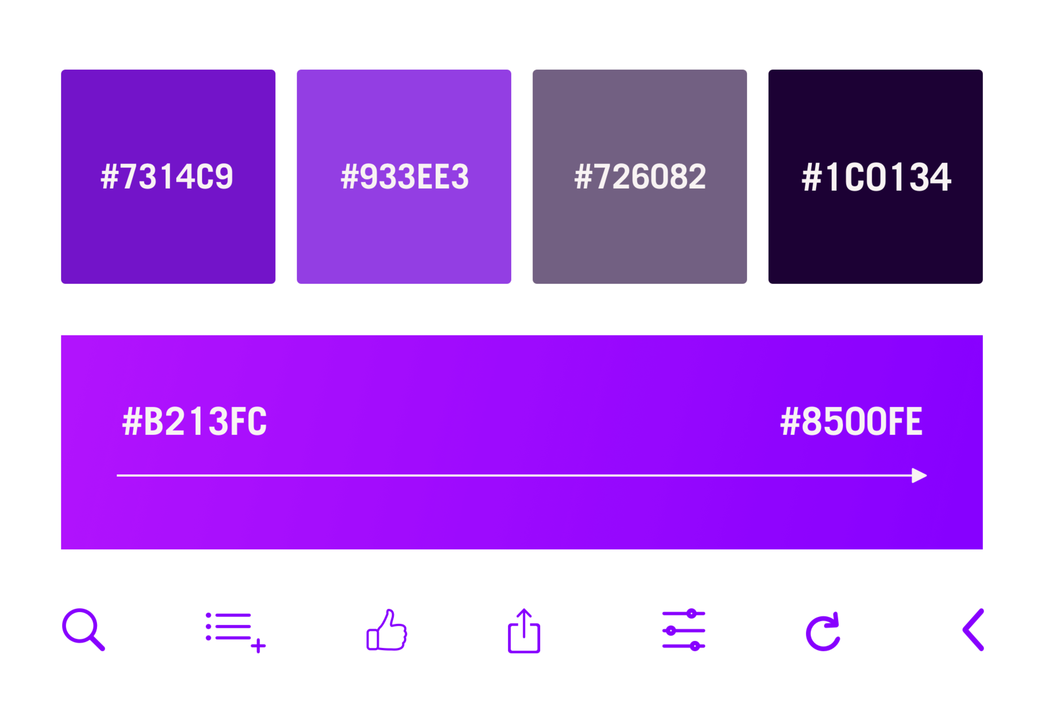
I wanted to experiment with using dark theme for the UI so for the color palette, I opted for tones of purple and black. Purple is often associated with elegance and luxury while black is very contemporary, a style and feel that I wanted to invoke in users. I also incorporated a purple gradient to add a dynamic and fun touch to my screens.
Iteration
I received feedback on my screens from experienced iOS and Android users in order to ensure that I was following appropriate design guidelines and had the same look and feel as a user would expect to see on the app. I then iterated on my designs and made sure that all screens were pixel perfect prior to final handoff.
Feedback #1 (iOS)
“The log in button at the top of the screen seems to break up the flow of the logo.”
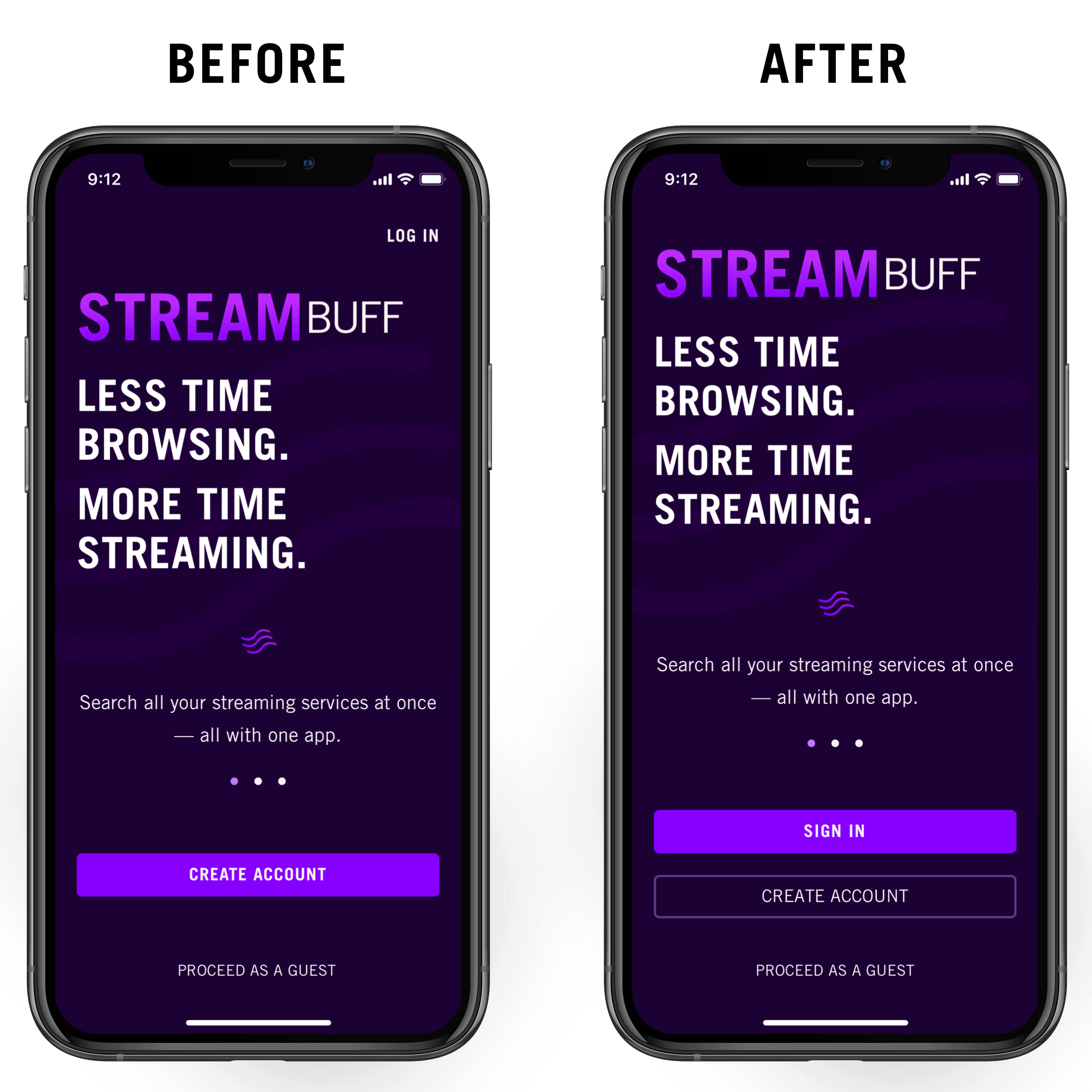
Feedback #2 (Android)
“I was not sure if “One or more devices is missing” was a clickable link or not.”
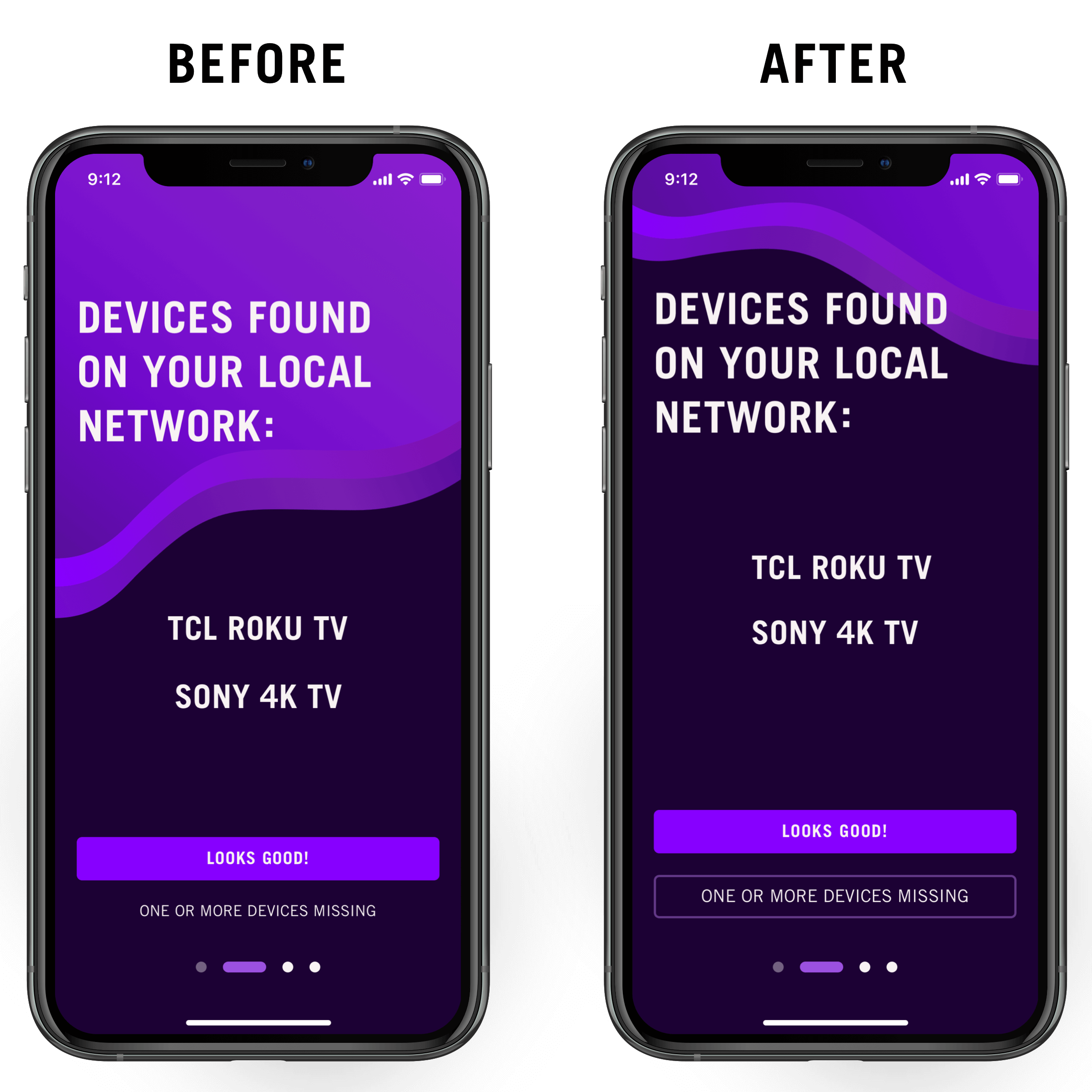
Feedback #3 (iOS)
“The color of the keyboard does not feel harmonious with the rest of the screen.”
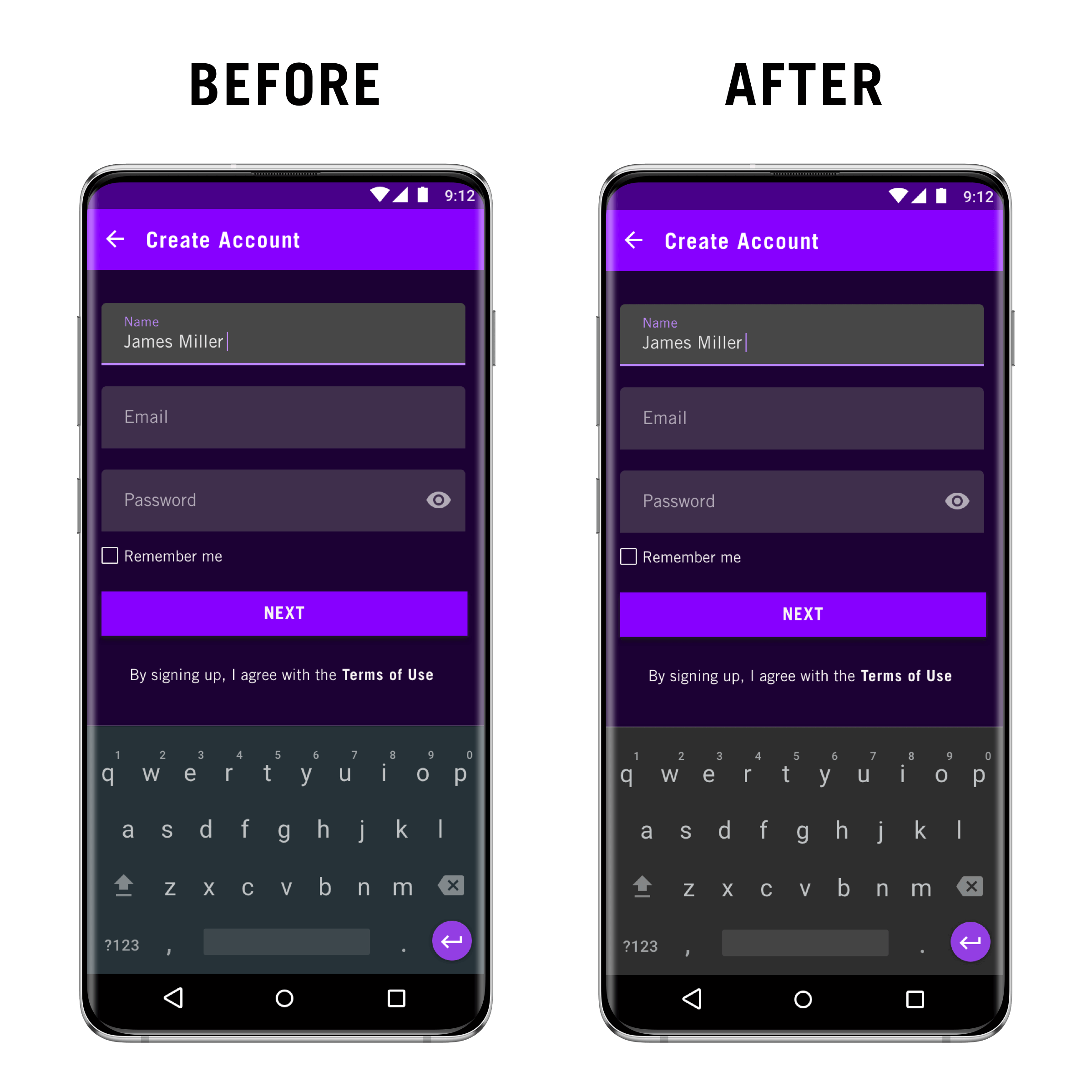
Final UI
Android
iOS
